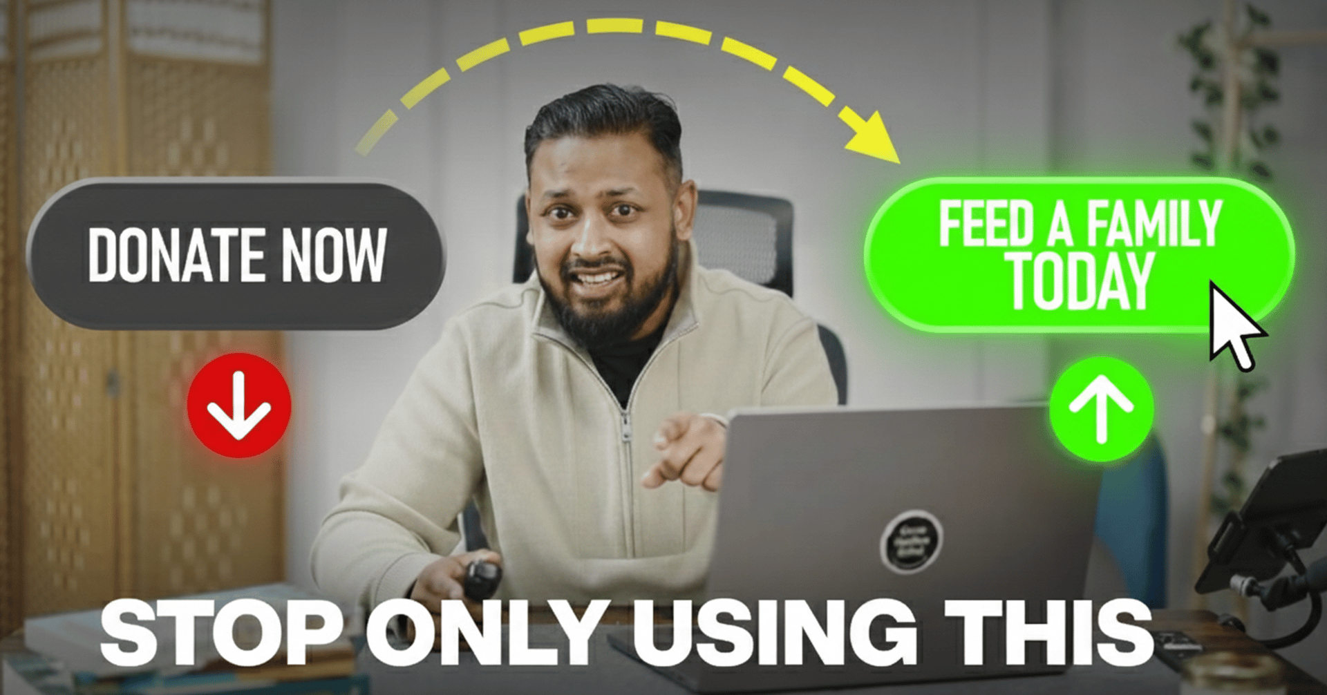
Most donation pages have the same problem:
the main button makes you feel nothing.
This month I checked dozens of charity sites.
Nine out of ten still only use “Donate Now.”
No story.
No emotion.
No sense of what the donation/gift actually does.
But that single line can move conversions by up to 30%. Don’t just take my word for it, FundraiseUp have run enough tests to prove it.
And honestly… it makes sense.
People don’t click because of logic.
They click because something moved them a moment earlier - and the button either carries that feeling forward or kills it.
Today I want to show you how to fix it in a way that’s simple, fast, and works.
Why This Tiny Change Matters
When someone reaches your donation page, it’s never “just a transaction.”
They’re acting on empathy - maybe even guilt, fear, or hope.
If your call-to-action feels cold, generic, or mechanical, it cuts off that emotional flow.
You don’t donate to complete a form.
You donate because you want something good to happen.
That final button is the bridge between the feeling you created… and the action you want.
Get it right, and you raise more.
Get it wrong, and the moment slips.
How to Fix It Using My Emotional CTA Framework
Step 1: Pick the emotion behind the gift
Ask yourself: What will this donation actually change?
Food.
Shelter.
A blanket.
A school bag.
A meal.
A safe night.
Write the outcome in one short line.
Swap “Donate” for “Feed a Family Today.”
Swap “Submit” for “Send Winter Relief.”
Swap “Next” for “Protect a Child Tonight.”
Short. Clear. Human.
Step 2: Add micro-impact
If £10 or £25 does something specific, say it plainly.
“Give £25 to Provide 10 Meals.”
“Give £50 to Deliver Clean Water for a Month.”
Tests show this kind of clarity lifts conversions by 23–37%.
People respond to knowing exactly what their money does.
Step 3: Keep impact + payment visible at the same time
Don’t make donors scroll up and down to piece things together.
Keep the amounts on the left and the emotional CTA on the right — eye-level, side-by-side.
Let the feeling and the action sit next to each other.
Step 4: Test two versions
Use Hotjar, Convert.com, or even a simple Optimize setup.
Half see:
Donate Now
Half see:
Give £20 to Shelter One Person Tonight
Run it for 7 days.
Let the numbers decide.
Step 5: Document the winner
Once you know what works, lock it in across everything:
Donation pages
Emails
Paid ads
SMS
WhatsApp broadcasts
Even your social posts
When donors see the same message in many places, the decision becomes easier.
Real Proof This Works
Charity: water lifted conversions by 28% when they changed their button to “Join the Mission.”
Save the Children saw a 31% lift on mobile after switching to emotional CTAs.
And none of these required extra spending.
Just better language in the box donors stare at the most.
The Bottom Line
You don’t need a new campaign.
You don’t need a fancy video.
You don’t need a bigger budget.
You just need better buttons.
Change one line and make every donor feel like their click actually matters
I hope this was helpful, see you next Friday.
Until next then, whether you’re trying to improve yourself or your organisation, keep building better.
Zain

P.S. Want more of this kind of stuff each week? Press this one button. Takes just one tap too :)
I share real stories, frameworks, and lessons to help charities and startups grow smarter (and a little more human).

